2. Editor
2.1 Adding a section
2.2. Slide a section under the menu (special function only for some templates)
2.3. Adding content to a section
2.3.1 Text pagelet
2.3.2 Image pagelet
2.3.3. Gallery pagelet
2.3.4. Download file pagelet
2.3.5. Contact form pagelet
2.3.6. Google Maps pagelet
2.3.7. Youtube video pagelet
2.3.8. Html pagelet
2.3.9.Button pagelet
2.3.10. Columns pagelet
2.3.11.Contact information pagelet
2.3.12. Card pagelet
2.4 Moving or deleting a pagelet
2.5. Logo
2.6 Adding another page of the site
2.7. SEO settings
2.8. Publishing the site
2. Editor
2.1. Adding a section
The basic element of creating a website in Webmium 3.0 editor is the so-called section. All other content elements of the website (called pagelets) are inserted into this element.
The menu for creating a new section, the "Add section" button, is always displayed at the beginning and end of an existing section or on an empty page under the navigation menu bar.
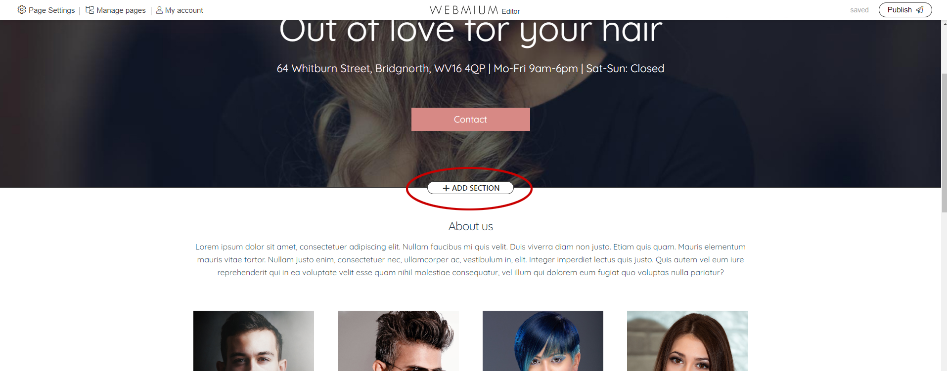
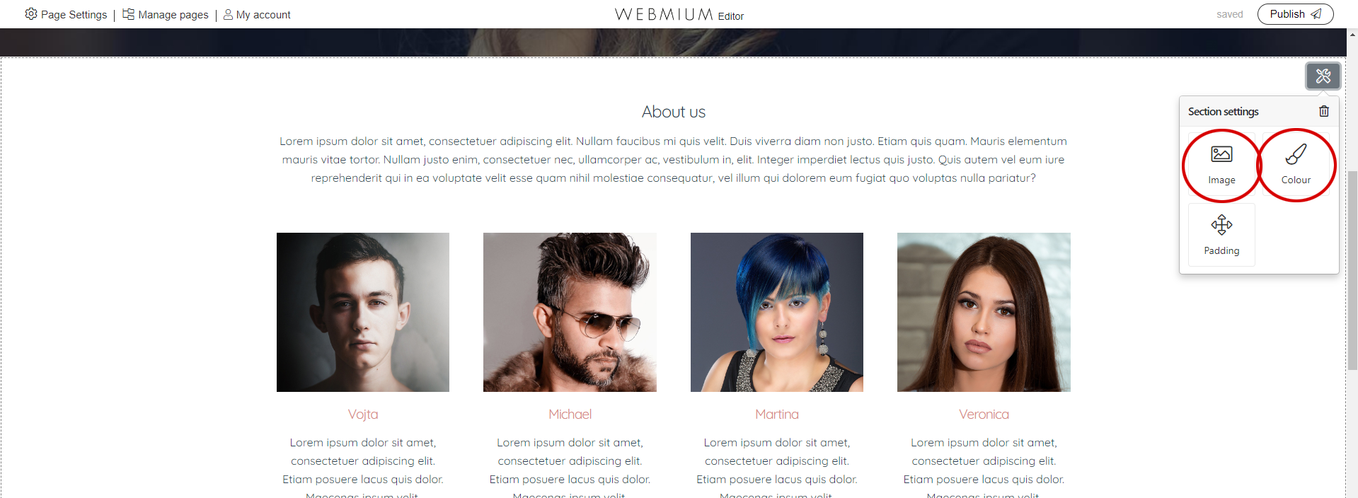
The section differs from other elements in that it is a bar across the entire width of the page, which can be set as a background colour or image.
TIP: The size of the background image of the section should be at least/optimally 1920px wide (the height depends on the specific application), and the file size of the image should not exceed 1MB. The format must be jpg, png or gif. |
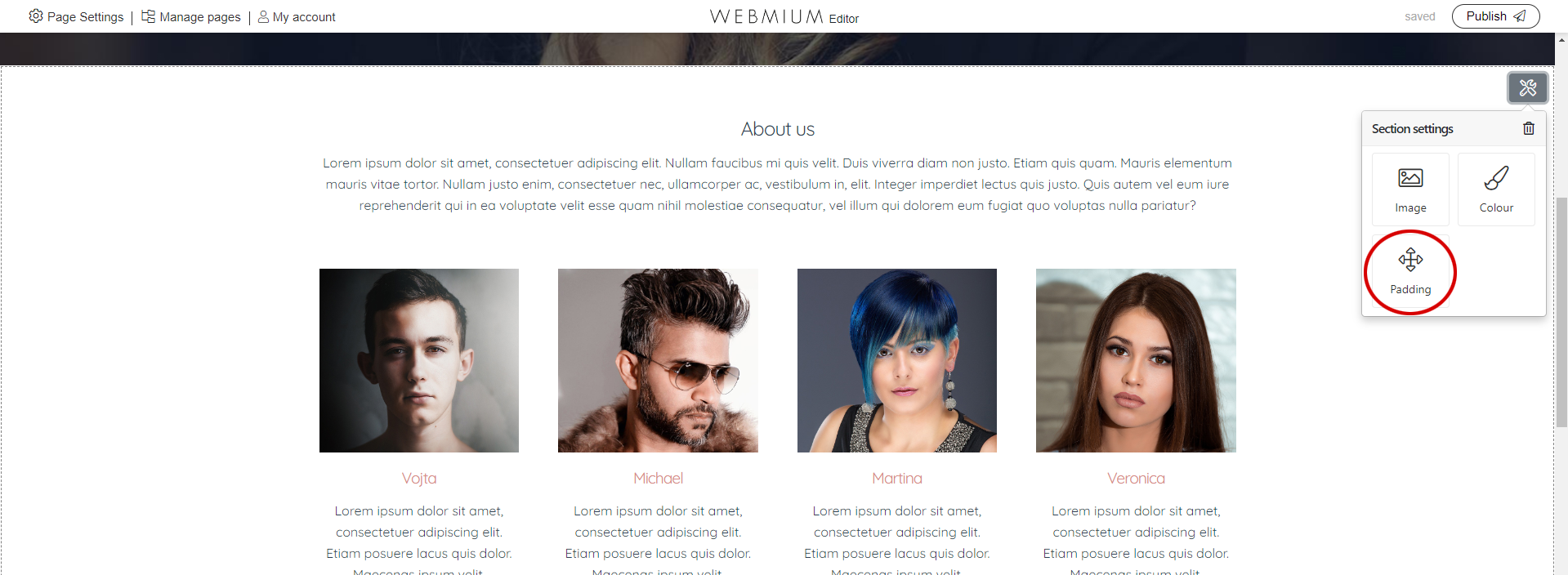
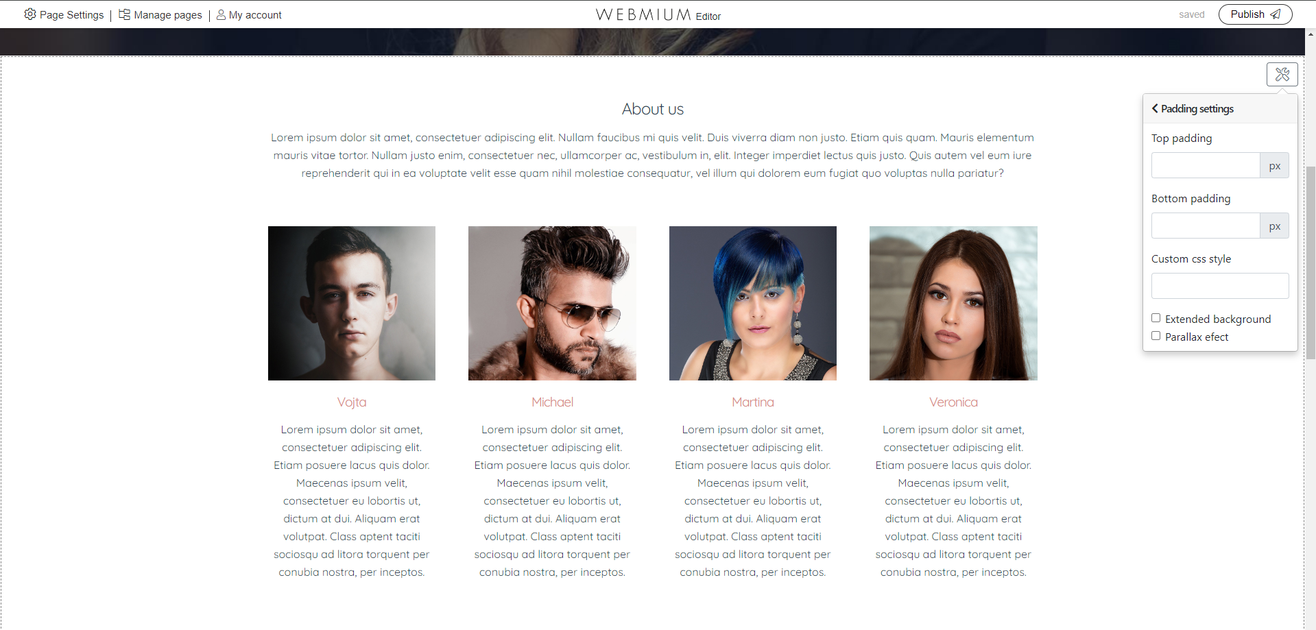
The "Padding" option is also important:
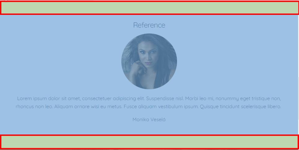
Here you can set the top and bottom internal indentation of the section, which determines how much "free" space will be kept at the top and bottom of the section from the content of the section (e.g. text or image).
To give you a concrete idea, in the image below we can see the free space highlighted in green in the red frame, which we get by setting the top and bottom indentation to 50px.
In the css style field it is possible to set a custom css class for the section (intended for more advanced users who can then edit the css code).
The fixed background image menu turns on the css parallax effect (dynamic effect when scrolling on the page).
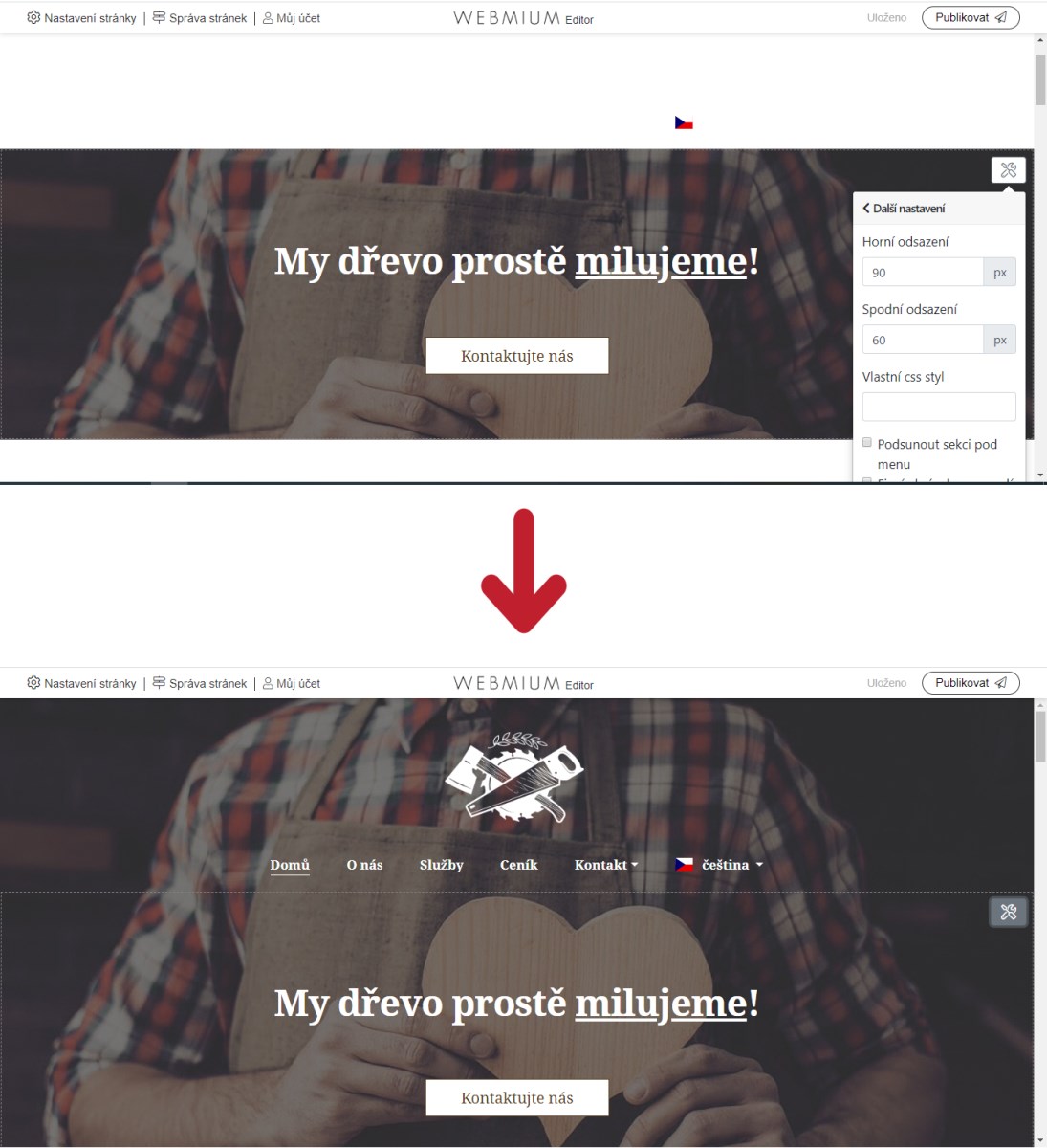
2.2. Slide a section under the menu (special feature only for some templates)
In addition, templates that have a menu directly on the homepage image (Hairdresser, Carpenter, and Wedding Photographer templates) have an option in the "Other Settings" section to "Slide section under menu". By default, all of these templates have the first section set up this way, i.e. the section with the homepage image. If you delete the introduction section here and want to set a new image to be placed under the menu, you have to enable this function by checking the option "Slide section under menu" - see picture:
2.3. Adding content to a section
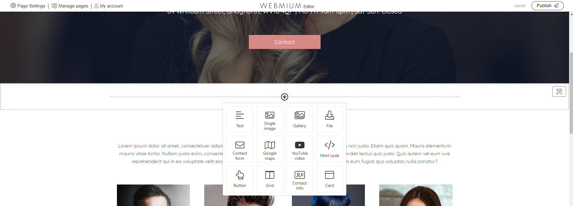
If you hover your mouse over the newly created section, you will see a button with a "+" symbol. Clicking on this button will expand the menu of content items available to us (we will call these content items "pagelets" from now on).
2.3.1. Text pagelet
Pagelet text allows you to insert text. Pagelet allows simple text formatting, headings, bullets, plain text, changing text color, font size, inserting an image to text, etc.
2.3.2. Image pagelet
You can also insert an image via a separate pagelet. The image is always centered and will always be the maximum size possible. If inserted into a section separately it will cover the entire width of the web content. If inserted into one of the three columns it will take up one third of the width of the content.
*If an undersized image is embedded, the image will be at its maximum original size (i.e. an image 500px wide on a 1000px wide row will only be 500px wide and center aligned).
It is possible to set a link to the image, as well as an alternative image caption.
| TIP: All images that you want to include on the web must be in jpg, png, or gif format (with gif images you need to pay attention to their format to avoid color changes after uploading). |
| TIP: If you need to upload an image that is partially transparent (most often a logo or icon), it must be in png format. |
2.3.3. Gallery pagelet
The gallery is used to upload a large number of images. The images can be aligned 4 by 4, 3 by 3, 2 by 2, or one by one. Clicking on an image opens a lightbox gallery where larger thumbnails of the images can be viewed.
| TIP: You can upload jpg, png or gif images to the gallery. |
| TIP: If the images look out of focus when loaded into the gallery, try temporarily changing their layout, e.g. from 4 images/row to 3 images/row, then switch back to the desired alignment (e.g. 4 images/row) once the sharpening has taken place. |
2.3.4. Download pagelet
Another element of the content is a pagelet that allows users to upload a file that can then be downloaded. Common file formats such as .pdf, .doc(x), .xls(x) etc. are supported. The maximum size of an uploaded file is 50 MB.
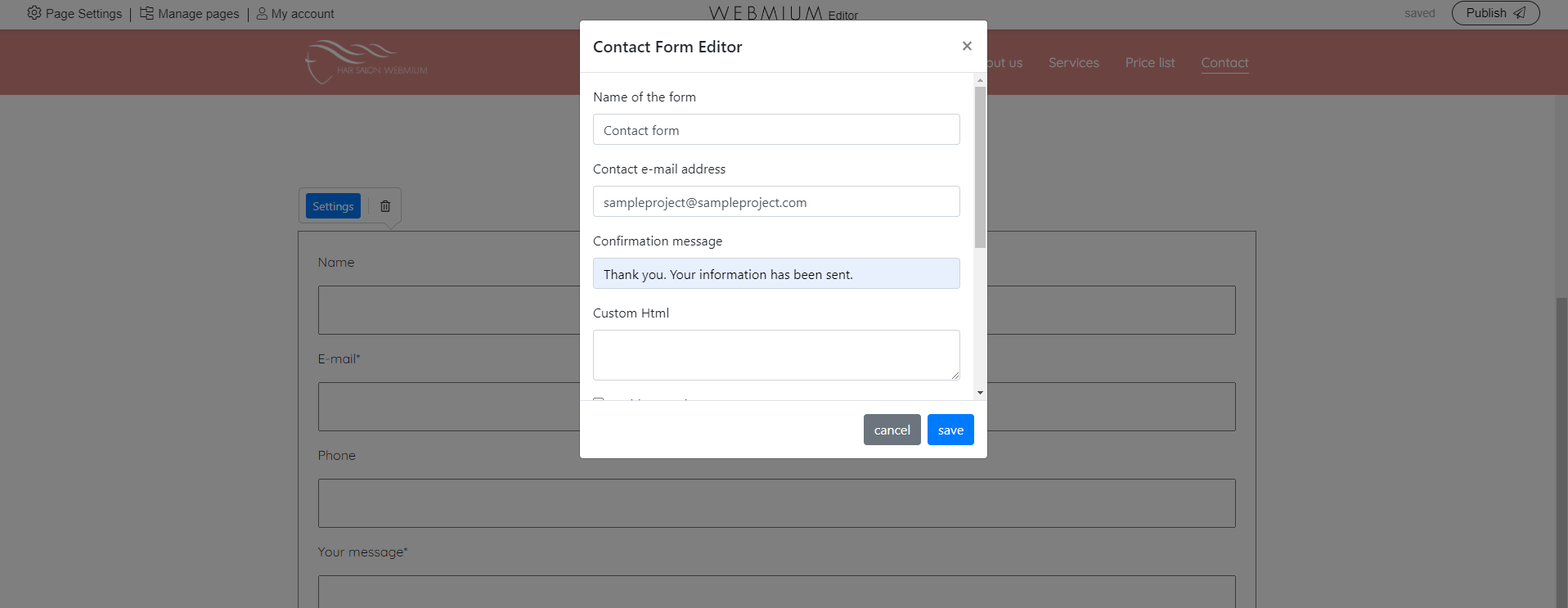
2.3.5. Contact form pagelet
You can also add a contact form to your website, through which visitors can send you a message or enquiry. You can set the email to which the messages should be sent, the text of the confirmation of sending the message, the code for measuring conversions (e.g. Google Analytics). You can also set up a spam-proof captcha, or a checkbox for consent to the processing of personal data.
2.3.6. Google Maps pagelet
Through these pagelets you can easily insert a map with the desired address on your website. Just select the pagelet in the menu and enter the address you want to display on the map.
2.3.7. Youtube video pagelet
This pagelet allows you to embed videos from youtube. Just select the pagelet and paste the url of the video.
2.3.8. Html pagelet
Html pagelet is a suitable tool for more advanced users if the possibilities of other pagelets are not sufficient. Or e.g. for inserting an external element via an iframe.
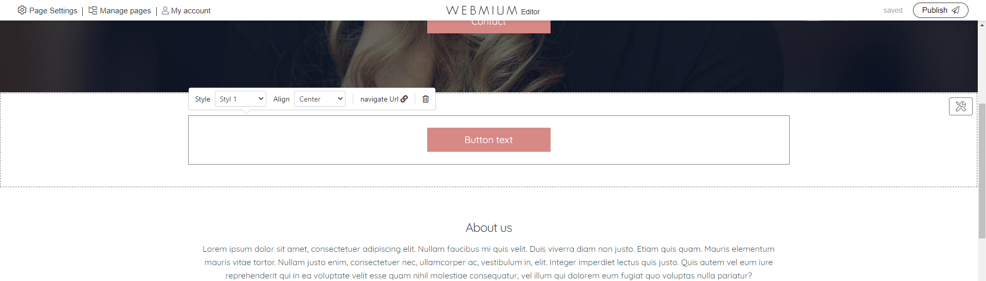
2.3.9. Button pagelet
The name of the pagelet button is telling enough. We will add that it is possible to choose from preset styles (color settings) of the button, it is possible to set the link (including the option to open in the existing or new window), choose the alignment of the button (right, left, centered).
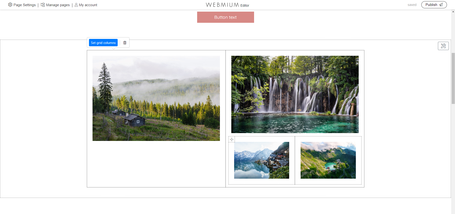
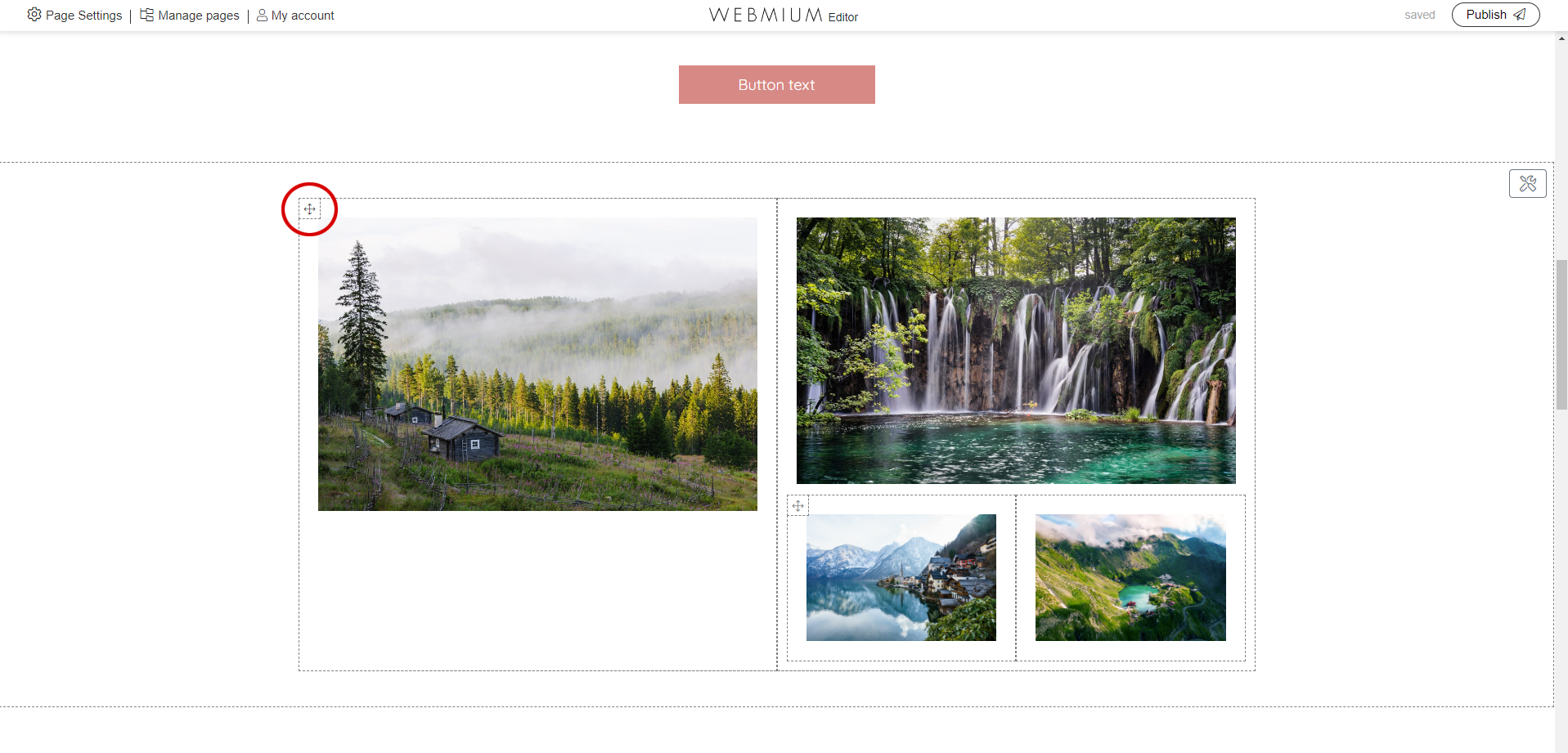
2.3.10. Grid columns pagelet
The "Grid columns" pagelet allows for different content layout options. These are illustrated graphically in the columns settings, where you can select your preferred layout - see below:
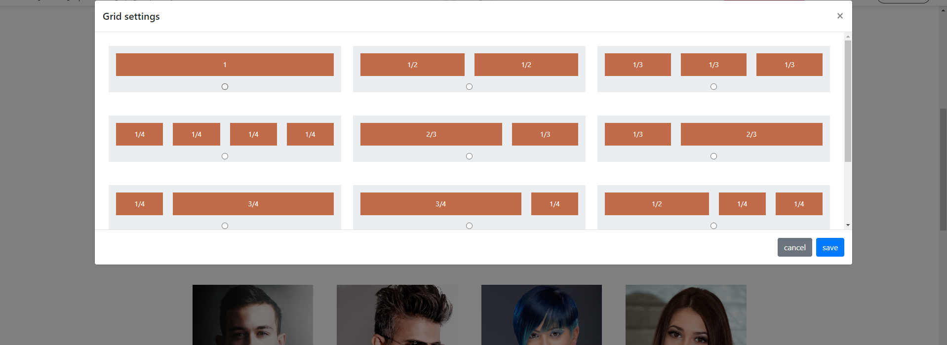
The default setting is two equally sized columns filling the entire row width together. You can put any pagelet into a column, including another grid columns pagelet - see Picture:
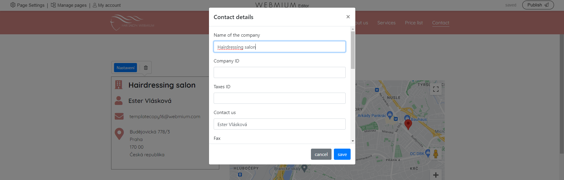
2.3.11. Contact info pagelet
This pagelet is suitable for easy insertion of contact information (e.g. company address, etc.) in a preset format. The pagelet is set so that only the information you fill in the settings will be displayed.
2.3.12. Card pagelet
Pagelet tab allows you to add a distinctive element on the site (a frame with text and a button) in a very simple way, where you just select what you want to display, type the text and upload an image if necessary. Below we will see how the pagelet tab looks like and what the different fields we can set correspond to.
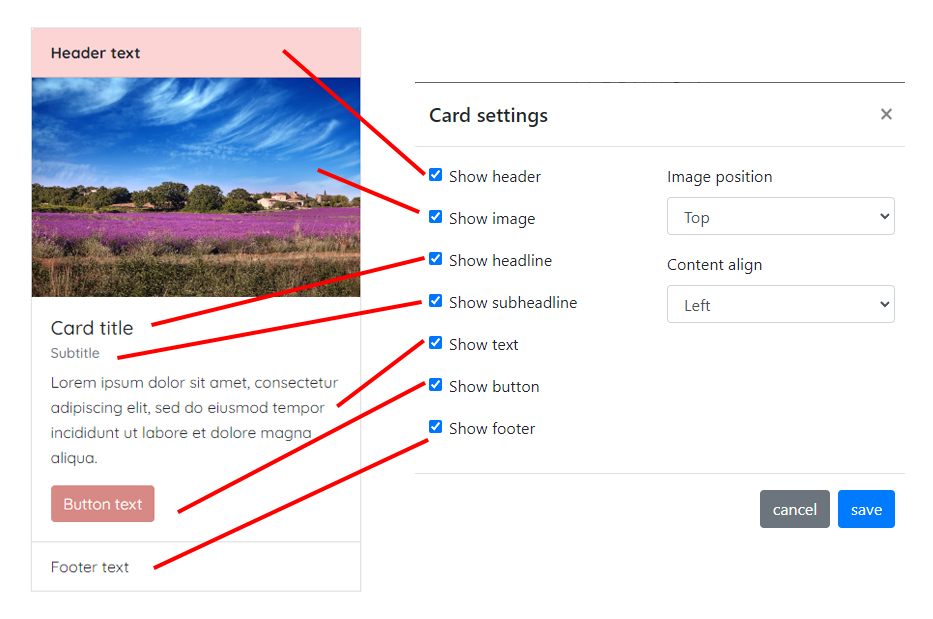
Only the fields that you select to display will be displayed. This in effect gives a large variation of possible pagelet displays and uses.
TIP: If you choose the "Background" image position, you need to edit the image in the graphic editor beforehand so that the text displayed on it is readable afterwards. *Supported image formats are again jpg, png and gif |
2.4. Moving or deleting a pagelet
You can move a pagelet both within a section and to another section. Similarly, you can move pagelets between columns. The easiest way to grab a pagelet is to hover your mouse over the four-way arrow icon in the upper left corner of the pagelet frame...
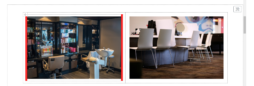
If a pagelet, e.g. the "Image" pagelet, is nested in the "Columns" pagelet, you need to move the pagelet by moving the mouse to the left or right empty part of the pagelet frame (marked in red in the image below). The mouse cursor will change to a four-way arrow and you can drag the pagelet. Everything is done in the classic drag and drop method.
To delete a pagelet, click directly on the pagelet to display the pagelet settings menu. There you will find a trash can icon (see image below) that allows you to delete the pagelet. *If another pagelet is nested in the Columns pagelet, you need to click on the border frame of the Columns pagelet. Clicking on it will display a menu with settings options.
2.5. Logo
A separate element of the website that needs to be set up is the logo. Depending on the type of template, it can be found either on the left on the same line as the menu or in the middle above the menu. To set the logo, click directly into the logo area. If we don't have our own logo and a text logo is sufficient, we can just type in the text e.g. "Hairdo Hairdresser". If we do have a logo, we will ideally insert it as a png image (with a transparent background) via the "Upload new logo" menu.
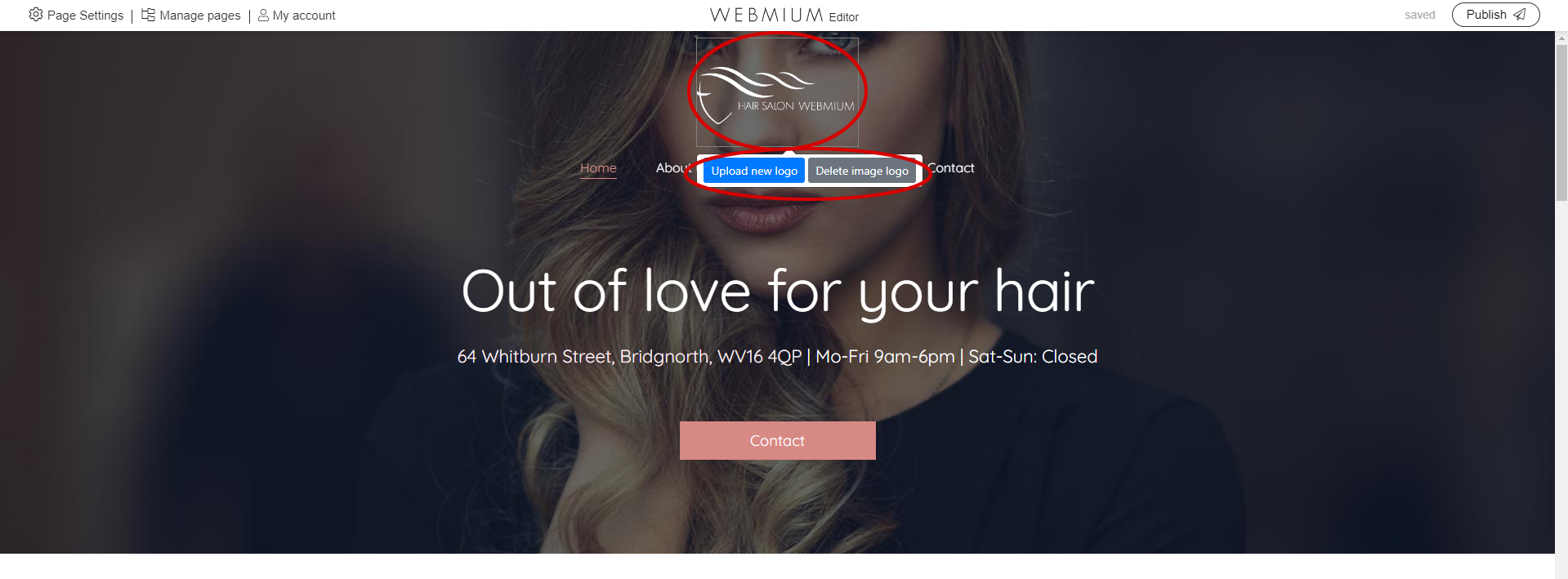
TIP: If you have a logo with a transparent background (optimal) you need to upload it in png format to maintain transparency. |
2.6. Adding another website page
In the top control bar we can also find the "Manage Pages" menu, after clicking on it we will see the existing structure of the site. Here we can add a new page and use the arrow menu (see picture) to specify where in the menu it should be displayed, but also at what level (first level menu, second level menu subpage, etc.).
ATTENTION: If you delete a web page, all of its content is deleted. |
The site management module also includes a feature that is very useful especially for larger sites that contain similar pages - for example, individual service or product pages. This feature is the ability to copy a page, which can be found in the page management by hovering the mouse over the page - it will be displayed on the far right as an icon of two overlapping pages (see picture below).
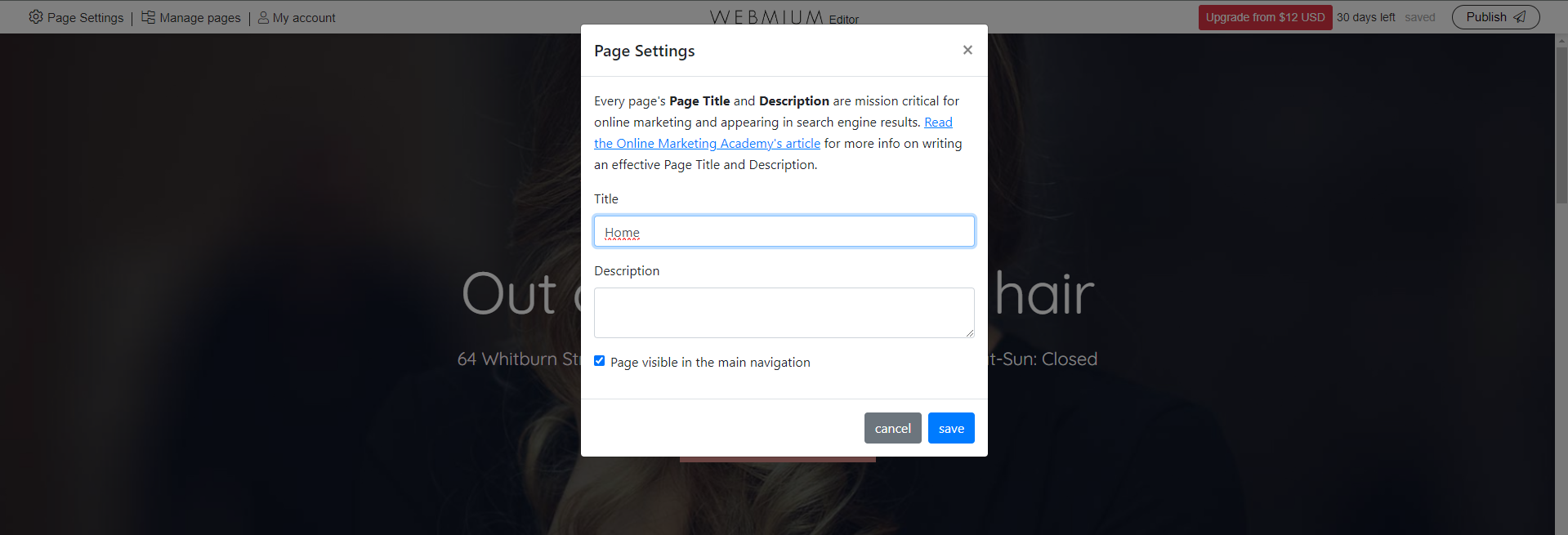
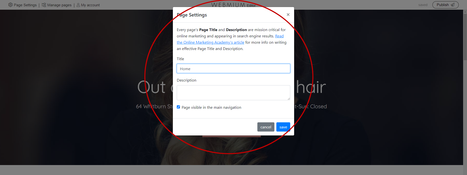
2.7. SEO settings
Webmium editor 3.0 also allows setting metadata for search engines. Click on "Page Settings" in the top control panel. A window will open where we can fill in the SEO title and SEO label. We set the SEO individually for each page of the website.
2.8. Web publishing
When we are happy with our website and would like to publish it to our test/working domain (or to a live domain if we have already paid for a site traffic package and linked a live domain) , we do so by clicking the "Publish" button in the top right corner of the control panel.